Are you still looking for a way to believe your website or blog has a responsive design, Well this is what you need to check after creating your blog/site.
What does responsive design mean? I guess you ask yourself this question, responsive design is the way one can understand if his or her blog is mobile friendly, meaning your blog/website can be compatible with any internet browsing app or PC browsing software.
Many bloggers take it that after creating your blog nothing further is necessary, but to be honest you need to build your website or blog to a situation where everyone can easily access it without getting issues.
Because nowadays you will find some blogs do have not good enough design, from their layout, contents, and even responsiveness, this is why I would like you to use this method to check if everything is normal on your website from the headers, sidebars, fonts, images, and the layouts.
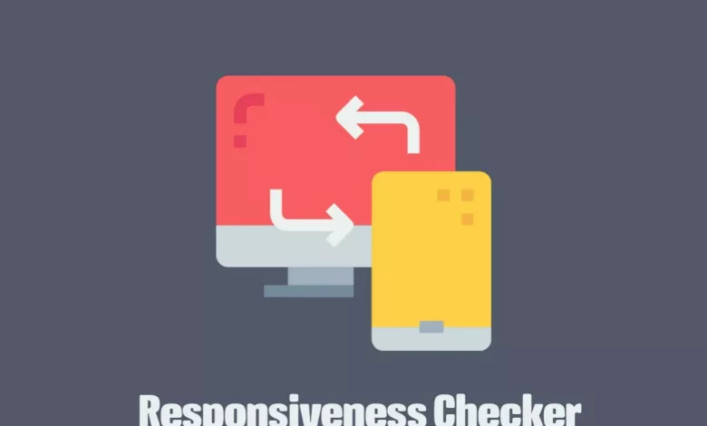
How To Check If Your Blog Site Is Responsive
Well, there is only one way to do so either uses a PC to check your website in mobile and desktop view or follow these instructions if you don’t have a PC.
• Visit this web design checker
• Input your blog/website link, and hit enter
• Wait for a few seconds to load and display your blog or website
• You can use the options there to check the view on Desktop, iPhone, and Android.
Hope this article helps you to simplify how you can check the responsive design of your blog or website.